Wednesday, 2 September 2009
In The Mood

Labels:
1940's,
Editorial,
Florals,
Outdoor,
Photography,
Steven Meisel,
Stylist,
Vogue US
Chloe.
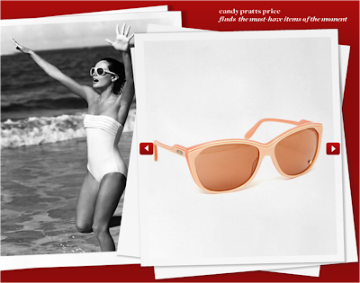
Polaroid Lookbook
 This is just a small snippet from style.com's website, displaying some of the best looks in summer, in a way i found very catching for a possible lookbook. I think a young, and upbeat store, such as New Look, Dorothy Perkins, or even a cosmetics store such as Lush, would benefit greatly from an easy to look at design such as this.
I would fold it vertically, so the front cover shows 3 square, 2 pictures and 1 block with text, then fold it together and secure with some string and an appropraitly painted silver tag to hold everything together.
Just an idea.
Tuesday, 1 September 2009
J'adore Paris.


I've always had an urge to visit the wonderfully, beautiful city, that is Paris. I just think France is the prettiest and most peaceful of places anyone would ever want to live.
I would to love to live my life in Paris in the future out of all hot fashion destinations.
I could never see myself as New York fashionista, to me, the city is too big and congested, although Times Square is a truely sureal sight at night time. Paris however offers the perfect balance of illuminated landmarks and streets as well as grass areas to just relax in and take in the wonderful scenery whilst enjoying a picnic filled with mouth watering French delicicies!
On this note, im going to go to bed and dream now..
The Copenhagen Look.


I'm loving the copenhagen look. This look definitly does Chanel justice in the quote 'simplicity is the note of all key elegance'. I think all these women look so fresh and elegant, by the use of simple shirts and dressed, teamed with pumps or even lace up shoe boots.
more at: www.copenhagenstreetstyle.dk
Oversize Chanel.
Teacake Delight
 These images snapped from The Dwelling House, situated in Cornwall are inhabitantly known for their delicous indulgent cream teas.
This image is so sweet, and has really inspired me now to do some cake making to unleash some creativity whilst making food! What more could i ask for!!
The top one, with a star shaped pastry topping sprinkled magicly with icing dust is just getting me all excited for xmas now too!!
Mulberry a/w 2009

This photo was originally supposed to be used as a net for capturing the new suede boots expected of the upcoming collection.
But i couldn't help but notice the lookbook shown at the bottom. I think it's such a unique and different approach to what Mulberry usually take. Using beetles as a patterened background to which they layer they're bruised purple text in the signature font.
I think the idea behidn using beetles is to convey a collection of deep, rich colours next season, proving to be fragile gem pieces, bursting with energy from within. Great symbolism for an autumn/ winter approach Mulberry!
Subscribe to:
Posts (Atom)


![Bows[&&]Buttons](https://blogger.googleusercontent.com/img/b/R29vZ2xl/AVvXsEjokPDzfYenD6vpTByVrPW5ydb4zPnnE5eDjODzMhkk0-sQ5lPBk4ITxURiOjDVwIZ24HP2-hoIMnq45NhsvpLalA_M3Q2JWwpTko8n9NlFoEhTqcEIFcY_zCfW81IP0ZZ6jE4PtEc1thM/s150/agyness.jpg)


